


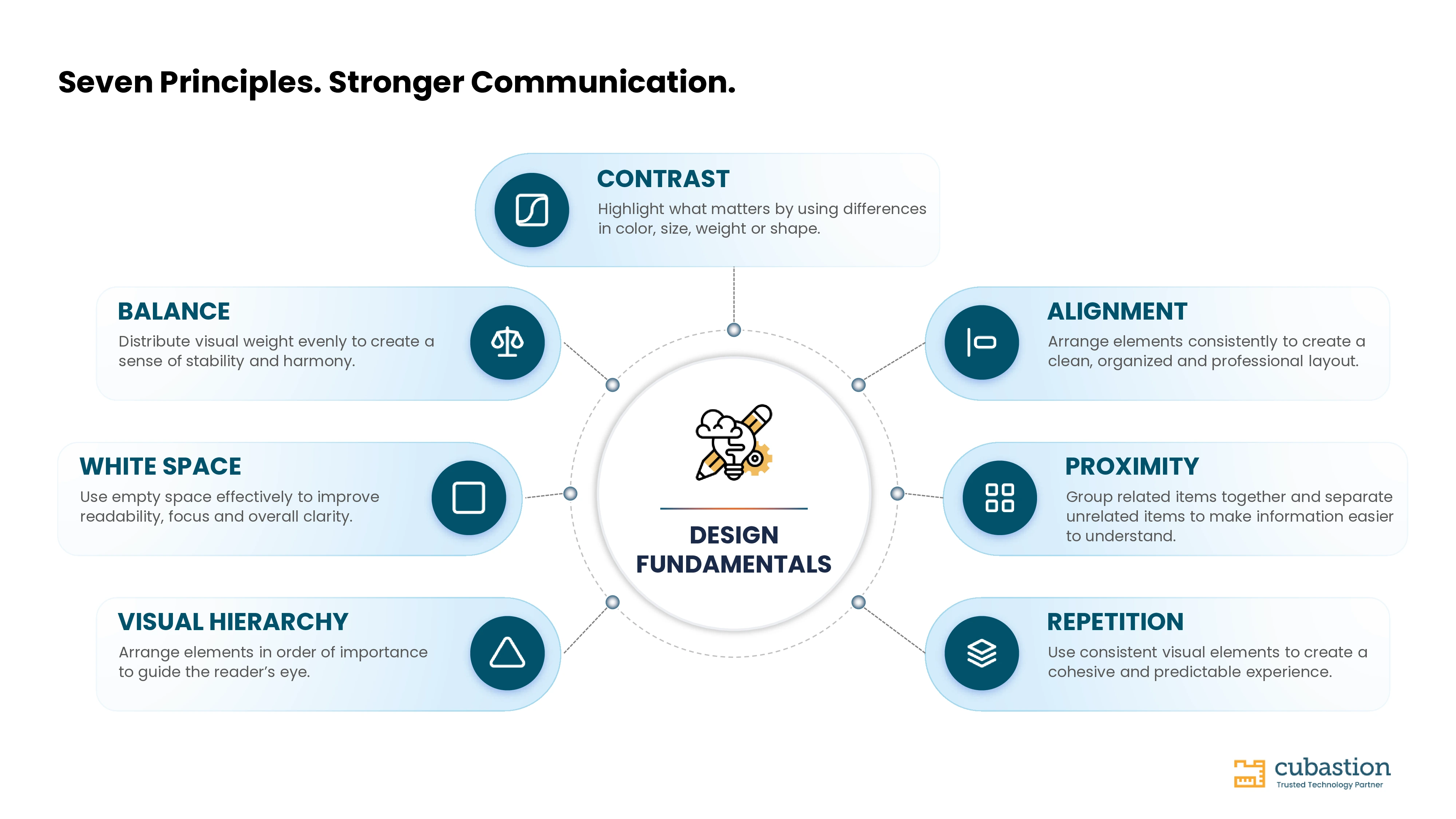

Great design starts with strong fundamentals and those fundamentals are useful far beyond the design team.
Design is not simply about making something look attractive. It is about making information clearer, more purposeful, and easier to understand. |

Seven fundamental principles that shape clear and effective visual communication
Design Is Not Just for Designers - It Is a Professional Skill
When people hear the word design, they often imagine stunning websites, creative logos, mobile applications, or visually appealing marketing campaigns. While these are all products of design, they represent only a fraction of what design truly is.
Every day, regardless of our role, we create something that communicates information: a presentation for leadership, a proposal for a client, a project dashboard, a business report, an email, or even a simple document. The effectiveness of these materials depends not only on the quality of the content but also on how clearly that content is presented.
Good design is not about making things look beautiful. It is about making information easier to understand, easier to navigate, and easier to remember.
As professionals, we often focus heavily on what we want to communicate but spend much less time thinking about how we communicate it. Yet the “how” can significantly influence whether our message is understood, trusted, or overlooked.
Over the years, while working on presentations, digital assets, and standardized design systems, I have seen how strong fundamentals consistently separate average communication from effective communication. These principles are not reserved for designers, they are valuable skills for every professional.
What Does Design Really Mean?
Design is often mistaken for decoration. In reality, design is a structured way of solving communication problems. A well-designed presentation helps leaders find the message faster. A well-designed dashboard helps teams identify insights quickly. A well-designed report makes complex information easier to absorb. A well-designed interface reduces unnecessary effort for the user.
The objective is simple: help people understand information with greater clarity and less effort. |
When design is approached as a problem-solving discipline rather than an artistic exercise, every visual decision becomes intentional.
Seven Design Fundamentals Every Professional Should Know
1. Contrast - Creating Focus
Imagine reading a document where every heading, paragraph, number, and button looks almost identical. Where would your eyes go first? Contrast creates emphasis by making important elements visibly different from the information around them.
Contrast can come from color, size, font weight, shape, position, or spacing. A bold heading separates itself from body text. A key number can become the focal point of a dashboard. A call-to-action becomes easier to locate when it clearly stands apart from surrounding content. When everything receives equal emphasis, nothing truly stands out.

Illustration — 1. Contrast: poor vs. effective application
2. Alignment - Bringing Order to Information
Alignment is one of the simplest design principles, yet it has a major impact on how professional a layout feels. Random placement creates visual noise; consistent alignment creates structure.
Headings, text, images, charts, and icons should relate to a common grid or reference point. Good alignment makes information easier to scan and creates a sense of precision. It is often invisible when done well, but poor alignment is immediately noticeable.

Illustration — 2. Alignment: poor vs. effective application
3. Proximity - Organizing Related Information
Our eyes naturally interpret objects that sit close together as belonging to the same group. Proximity uses that behavior to communicate relationships without adding unnecessary borders, boxes, or labels.
A chart title should sit close to its chart. A metric should stay near its label. Related statistics should be grouped together, while unrelated sections need enough separation to feel distinct. Thoughtful spacing allows readers to understand the structure before they even read every word.

Illustration — 3. Proximity: poor vs. effective application
4. Repetition - Building Consistency
Repetition means intentionally reusing visual choices so the audience does not have to relearn the design on every page or screen.
Consistent typography, icon styles, colors, spacing, button treatments, and layouts create a predictable visual language. This is also one of the foundations of a design system: reusable patterns help teams maintain quality while reducing repeated design decisions.

Illustration — 4. Repetition: poor vs. effective application
5. Visual Hierarchy - Guiding the Reader’s Journey
Every piece of communication has an order of importance. Visual hierarchy makes that order visible and guides the reader through the message intentionally.
Hierarchy can be created with larger headlines, stronger weight, color emphasis, position, scale, and whitespace. On a presentation slide, the title may establish context, a key statistic may become the focal point, and supporting information can sit at a quieter level. Without hierarchy, the reader has to decide where to look; with hierarchy, the design provides that guidance.

Illustration — 5. Visual Hierarchy: poor vs. effective application
6. White Space - Giving Content Room to Breathe
Empty space is not wasted space. White space is an active design element that improves readability, separates ideas, and gives important content room to stand out.
Crowded slides and reports often try to communicate everything at once. The result is more visual effort for the reader. Generous spacing can make the same information feel calmer, clearer, and more confident. White space is especially valuable around headings, key messages, charts, and grouped content.

Illustration — 6. White Space: poor vs. effective application
7. Balance - Creating Visual Stability
Balance is the distribution of visual weight across a composition. A layout can be symmetrical, with similar weight on both sides, or asymmetrical, where different elements still feel visually stable.
Size, color, imagery, density, and position all contribute to visual weight. A large image on one side may be balanced by a strong headline and supporting content on the other. The goal is not perfect symmetry; it is a composition that feels intentional rather than accidentally heavy in one area.

Illustration — 7. Balance: poor vs. effective application
Why These Principles Matter Beyond Design Teams
These fundamentals apply far beyond graphic design. A consultant preparing a client presentation, a project manager creating a roadmap, a business analyst building a dashboard, a software engineer documenting architecture, an HR professional preparing employee communication, and a marketing professional creating a campaign report are all communicating visually.
Understanding the fundamentals helps ensure that communication is not only accurate but also easier to absorb. Better visual communication can reduce confusion, make important information easier to find, and support more effective conversations and decisions.
Common Design Mistakes We See Every Day
- Using too many fonts or font styles in one document.
- Applying multiple colors without a clear purpose.
- Filling every available space with content.
- Using inconsistent spacing between similar sections.
- Placing images and icons without a clear alignment system.
- Giving every element the same visual importance.
- Mixing icon or illustration styles.
- Overusing transitions, effects, or decorative elements.
These issues rarely come from a lack of creativity. More often, they come from overlooking the fundamentals. Strong basics solve many design problems before advanced techniques are necessary.
Design Fundamentals Create Better Experiences
Whether you are designing a presentation, building a dashboard, creating documentation, or developing a digital product, the same principles remain remarkably consistent. Strong design does not require every professional to become a designer. It requires thoughtful decisions about what deserves attention, how information is grouped, and how easily someone can move through the content.
Every color should have a purpose. Every element should relate to a structure. Every section should have enough space to be understood. Every page should guide the reader naturally.
Final Thoughts
Throughout my journey as a designer, one lesson has remained constant: the strongest designs are rarely the most complex, they are the most intentional.
Trends will evolve, tools will change, and technologies such as AI will continue to reshape design workflows. But principles such as contrast, alignment, proximity, repetition, visual hierarchy, white space, and balance remain at the heart of effective visual communication.
Whether you are a designer, consultant, developer, manager, or business leader, understanding these fundamentals can improve not only the visuals you create but also the impact of the ideas you share.
Because at its core, great design is not about decoration. It is about communication, and great communication is a skill every professional can strengthen. |
NEXT EDITION
Why Great Design Is More Than Just Aesthetics
We will explore how thoughtful design influences trust, user experience, communication, and business outcomes.